FEATURED PROJECTS

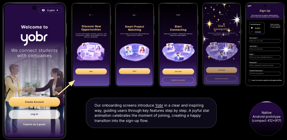
INITIAL PROTOTYPES - MOBILE

ROLE & COLLABORATION
This project was conducted in a team of three designers working collaboratively across research, ideation, prototyping, and usability testing.
We followed a shared ownership model where responsibilities were distributed based on project needs.
My contribution included user research, UX/UI design in Figma, usability testing, and analysis of findings to support iterative improvements.


OUTCOME & NEXT STEPS
The redesigned experience improved clarity, navigation confidence, and access to support.
Future improvements include expanded accessibility testing, further mobile optimisation, broader usability testing with additional user groups, and refinement of onboarding and guidance flows.
Overall, the project demonstrates how a structured, accessible, and emotionally aware design approach can significantly improve usability in sensitive contexts.
SOLUTION & ITERATION
The final design is a mobile platform for connecting companies with student talent through onboarding, discovery, profiles, and messaging.
The solution was refined through iterative testing between two prototypes.
Key improvements included:
simplified onboarding flow
clearer navigation and hierarchy
improved feedback states
enhanced messaging visibility and discoverability
The final design balances structured usability with a more modern visual expression.

REFINED PROTOTYPES - MOBILE
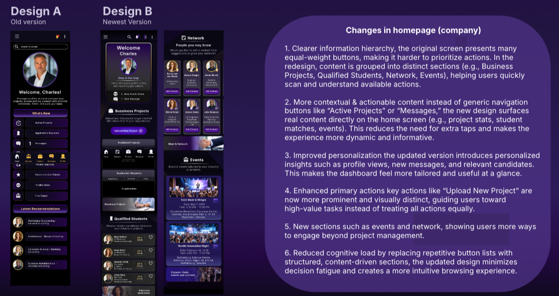
Based on usability testing, the mobile prototypes were refined to improve clarity, hierarchy, and overall user confidence. Key issues identified included cognitive overload, unclear navigation, and inconsistent feedback.
The updated design introduced more guided onboarding and registration flows, improved visual hierarchy, and clearer feedback states to reduce uncertainty. The homepage was restructured into a more content-driven dashboard, making key actions and information easier to access.
Messaging was also refined through clearer navigation, improved input design, and stronger visual consistency across interactions.
Overall, the changes focus on reducing cognitive load and creating a more intuitive and structured user experience.
STUDENT VIEW - HOMEPAGE

MESSAGES


KEY FINDINGS & INSIGHTS
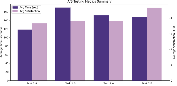
The testing revealed clear differences between the two prototypes.
Clarity and structure had a strong impact on user confidence, with more guided flows performing better in onboarding and task completion.
Prototype A performed better in structured flows, while Prototype B was more visually engaging but introduced higher cognitive load in some tasks.
Users relied heavily on clear feedback, navigation structure, and hierarchy to understand interactions, indicating that visual design alone is not sufficient without strong usability foundations.

UX DESIGN CASE STUDY - YOBR
PROJECT OVERVIEW
The YOBR project explores how a mobile platform connecting companies with student talent can create a clear, efficient, and engaging user experience for networking, discovery, and communication. The focus was on designing a high-fidelity mobile experience supporting onboarding, browsing opportunities, profiles, and messaging.
The work combines two course modules: prototyping and usability testing.
All design work, including task and user flows, mid-fidelity and high-fidelity wireframes, and high-fidelity prototypes, for mobile, desktop and smartwatch, was created in Figma.
TOOLS USED
Figma
Papers and markers
Microsoft Teams and Zoom
HYPOTHESIS
We hypothesised that a successful solution must balance clear structure for task efficiency, familiar interaction patterns, and engaging visual design without increasing cognitive load.
This approach would improve usability by making navigation more predictable and reducing friction in key user flows.
METHODS
We conducted A/B usability testing using two high-fidelity prototypes in Figma.
Three participants from the target audience completed tasks including:
onboarding and sign-up
navigating the home screen
using messaging features
We measured:
task success rate
time on task
error frequency
user confidence and satisfaction
KEY FINDINGS & INSIGHTS
The usability testing highlighted the importance of clear navigation, emotional accessibility, and quick access to support in sensitive contexts.
Participants responded positively to the supportive tone, role-based navigation, and visible support options, which improved feelings of guidance and safety. The redesigned structure also increased discoverability of relevant information and support pathways.
However, testing revealed challenges related to cognitive overload, unclear navigation paths, and dense content, leading to uncertainty around where to start or how sections were connected.
Overall, the results show that while supportive structure improves confidence, clarity in hierarchy and reduced information density are essential to prevent cognitive overload and improve decision-making.
PROBLEM STATEMENT
Many networking and talent platforms feel either overly complex or lack clarity in how users move between discovery, communication, and opportunities.
As a result, users often experience friction when trying to understand where to start, how to progress, and how to efficiently connect with relevant opportunities, which reduces overall usability and engagement.
RESEARCH & DESIGN DIRECTION
The project began with an exploration of existing platforms to define a clear design direction for a mobile talent networking experience.
We analysed LinkedIn, Messenger, and Vinted to understand established interaction patterns in professional discovery, communication, and browsing.
Key design principles identified:
LinkedIn – structured profiles and professional discovery
Messenger – familiar, low-friction communication
Vinted – intuitive and visually driven browsing experiences
This led to exploring a balance between structured task flows and more visually engaging discovery-based interactions, which informed the final design direction focused on familiarity, clarity, and efficient task completion.

SPLASH SCREEN - LOG IN
ONBOARDING & REGISTRATION
CREATE PROFILE
STUDENT VIEW
COMPANY VIEW
REGISTRATION
COMPANY VIEW - HOMEPAGE

HYPOTHESIS
We believed that a more structured, support-first experience with clearer hierarchy and simplified navigation would reduce cognitive load and help users find relevant help faster.
We also assumed that clearer pathways for different user groups would increase confidence and reduce hesitation in high-stress situations.
PROBLEM STATEMENT
Adults seeking help in sensitive child protection situations often experience urgency, emotional distress, and uncertainty.
While the existing adult support section contains extensive information, the lack of clear structure and guidance makes it difficult for users to quickly find relevant support and understand how to proceed.
DESKTOP CONCEPT
The desktop version was created to explore how the platform could scale across devices. However, usability testing and iteration focused mainly on the mobile experience due to scope and time constraints.
As a result, the desktop design was not user-tested and should be seen as a conceptual extension rather than a validated solution.
Both dark and light mode were explored for desktop to test visual consistency, while light mode was not fully implemented on mobile due to time limitations.
MESSAGES
GUEST VIEW
CONCLUSION
The results show that usability is primarily driven by clarity, structure, and predictable interaction patterns rather than visual complexity.
Prototype A supported efficiency and user confidence through its clear structure, while Prototype B provided stronger visual engagement but introduced higher cognitive load in some flows.
The findings highlight that the optimal solution lies in balancing usability and visual expression to support both efficiency and engagement.
CHALLENGES & CONSTRAINTS
One of the main challenges in the YOBR project was balancing visual engagement with clarity and usability. While Prototype B introduced a more modern experience, some interactions increased cognitive load and hesitation compared to Prototype A’s clearer structure.
Additional challenges included unclear registration flows, limited feedback states, and discoverability issues in messaging and navigation.
These issues were addressed through iterative improvements such as simplifying onboarding, refining hierarchy and microcopy, strengthening feedback states, and improving consistency across UI patterns and interactions.
OUTCOME & NEXT STEPS
The refined prototype improved task clarity, reduced friction, and increased user confidence in key flows.
Future improvements include:
testing with a larger user group
refining edge cases and error states
improving accessibility and onboarding guidance
further iteration on personalization and navigation
SOLUTION & ITERATION
Based on usability insights, the design was iterated to improve clarity, accessibility, and emotional support.
Key improvements included:
restructuring content into smaller, more scannable sections
improving visual hierarchy and navigation clarity
strengthening visibility of support and contact options
refining role-based pathways for parents, teachers, and coaches
improving accessibility through contrast, readability, and consistency
introducing audio playback to support users with high cognitive load
ROLE & COLLABORATION
This project was completed in a team of three designers. We worked collaboratively across research, ideation, prototyping, and usability testing using a shared ownership approach.
My contribution included user research, UX/UI design in Figma, usability testing, and analysis of findings to support iterative design improvements.
CONCLUSION
The findings confirmed that in emotionally sensitive contexts, users depend heavily on clarity, structure, and reassurance to feel confident navigating and taking action.
Even small friction points in navigation, hierarchy, or content density can reduce confidence and delay access to support.
Overall, the evaluation reinforced the importance of a structured, accessible, and emotionally supportive information architecture where users can quickly understand their options and next steps.
CHALLENGES & CONSTRAINTS
A key challenge was balancing dense, sensitive information with clarity and emotional support for users in potentially stressful situations.
Another challenge was designing clear navigation for multiple user groups (parents, teachers, coaches) while addressing unclear hierarchy and uncertainty around where to begin.
These constraints were addressed through improved navigation, clearer visual hierarchy, and more scannable content structures, alongside role-based guidance and audio playback to reduce cognitive load.
METHODS
We conducted scenario-based qualitative usability testing with parents, teachers, and coaches.
Participants completed realistic support-seeking tasks to identify navigation and usability issues.
We measured:
task success rate
time on task
user satisfaction (1–5 scale)
We analysed the results using thematic analysis and affinity mapping.
UX DESIGN CASE STUDY - ECPAT SWEDEN
PROJECT OVERVIEW
This project focused on redesigning the Adult Support section of the ECPAT Sweden website. The goal was to create a clearer, more accessible, and emotionally supportive experience for adults seeking guidance in sensitive child protection situations.
The focus was on improving structure, navigation, and content hierarchy to help users quickly understand available support and take action with confidence.
All design work, including user flows, wireframes, and high-fidelity prototypes for mobile and desktop, was created in Figma.
TOOLS USED
Figma
Papers and markers
Microsoft Teams and Zoom
RESEARCH & DESIGN DIRECTION
We conducted competitive analysis and usability research to identify key usability gaps in existing support experiences.
The analysis included organisations such as BRIS, Rädda Barnen, ChildX, and Mediemyndigheten, focusing on how sensitive information is structured and presented.
This revealed a need to balance detailed information with clear guidance and accessible support pathways.
Initial exploration considered both content-heavy and more guided, structured approaches. The final direction prioritised clarity, trust, and reduced cognitive load to support users in stressful situations.
REFINED PROTOTYPES - DESKTOP & MOBILE
Based on usability findings, the prototypes were refined to improve clarity, accessibility, and emotional support.
Key improvements included:
simplified content structure with smaller sections
clearer navigation and hierarchy
improved visibility of support and contact options
stronger role-based pathways for different user groups
improved accessibility through contrast, readability, and consistency
introduction of audio playback to support cognitive load reduction
These changes aimed to make support easier to access and understand in high-stress situations.